Slashback Magazine
Editorial
The Idea
The goal was to create an 80s slasher movie themed magazine publication that uses a different slasher icon as the main topic for each issue. The challenge was to make it unique and stand out from other horror magazines.

The Guidelines
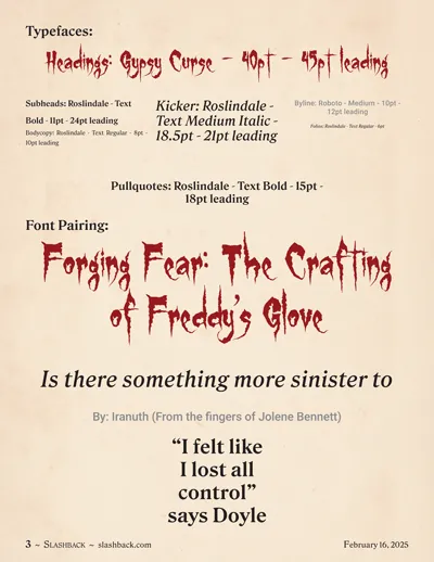
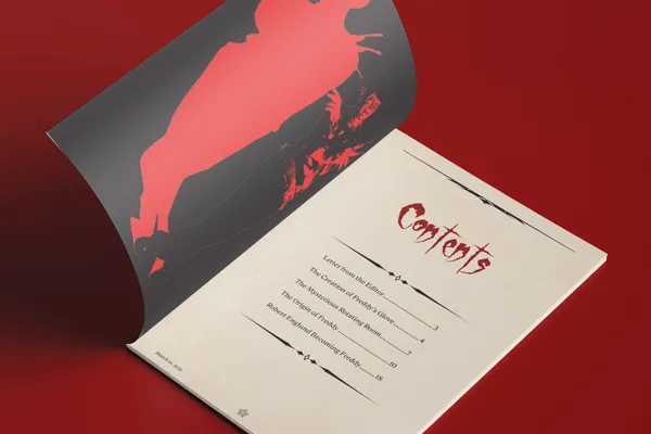
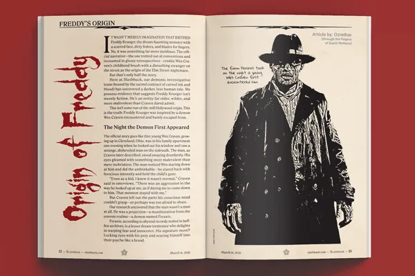
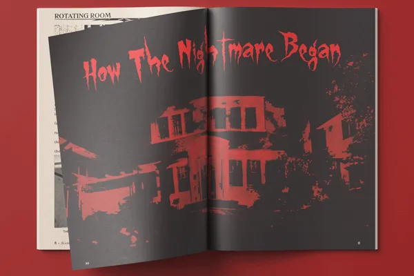
I used a traditional colour palette for fitting the horror theme such as black, red, and crimson. I added beige to this palette to give the inner pages an aged look to give them a creepy, long-lost book effect. Black and red were to be used for the cover and centre spread to contrast with the rest of the magazine and show more prominence. I found the typeface, Gypsy Curse, made the headings look like they were written in blood, especially when set in crimson. The bulk of the text was to be written in the serif typeface, Roslindale, to add to the old book effect. The sans serif font, Roboto, was to be used for the bylines to contrast with the rest of the text, but with a gray font colour to be less prominent than the body copy.
The Logo
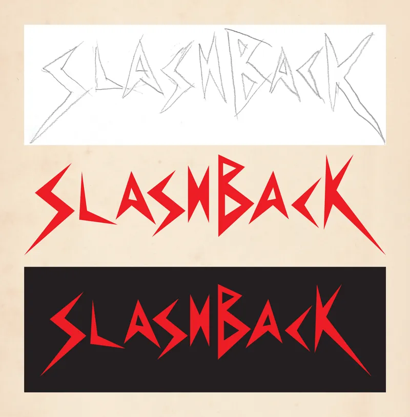
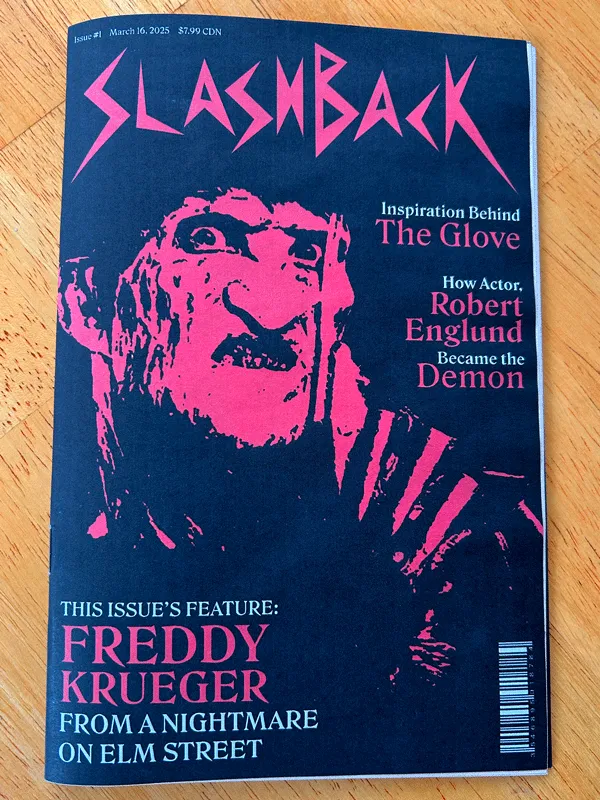
I wanted to go for an 80s’ style of lettering while also sticking to the slasher theme. I sketched out a wordmark where the lettering looks like actual slashes. I then made a digital illustration of this sketch. In red, it really helps to give the effect of slashes. This is further accentuated over a black background.
The Images
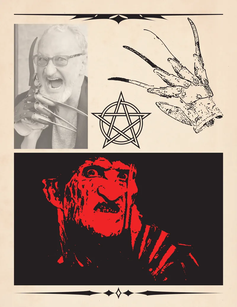
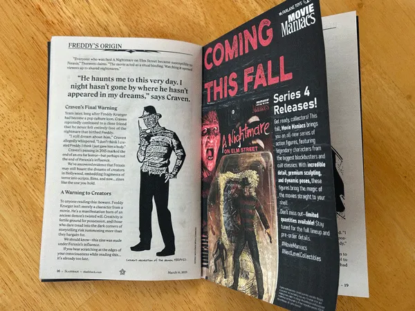
I treated the cover images by making them look like ghostly apparitions. I executed this by applying a red gradient map to these images in Photoshop and placing them over a black background to give off the aura of them glowing through the shadows. To keep up with the theme of making the inner pages look old, I used a combination of treating my images to look like black and white photos or inked drawings. This gives the imagery a similar look to what would be found in an old textbook or a “cursed spellbook”. I also applied sharp page furniture in the headers to give a gothic look to the pages. I decided to centre this issue around Freddy Krueger from A Nightmare on Elm Street because he is one of the most famous horror movie icons.
The Layout
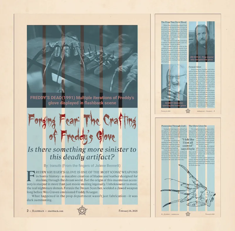
I set the dimensions of my magazine’s spreads to be 10.5” x 8”, making each page 5.25” x 8”. The margins would be 0.5” on the outer, inner, and bottom sides and 0.6” on the top side to allow space for running heads. Because the pages are so small, I employed a six-column structure. This allowed for a versatile layout for images and text without any content being too small to see or read.
The Cover
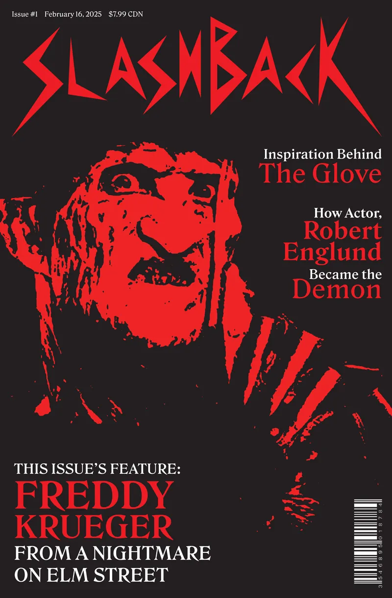
Since this issue focuses on Freddy Krueger, I wanted to make his image the main focal point of the cover. The gradient map used on his face gives off a ghostly vibe. I used a 3-colour flat design to make all the elements stand out more against the black background. The use of white font makes the smaller text more readable.

The Ad
I wanted to insert an advertisement that would be more appropriate for the target audience, which would be horror fanatic collectors in their 30s and 40s. Horror action figures are very popular among this crowd, so I made an ad for a Freddy Krueger action figure by Movie Maniacs (which is owned by Todd McFarlane Productions Inc.) I drew inspiration from other similar magazine ads for Movie Maniacs that use a similar dark grayscale brick background and large red font.
The Flatplan
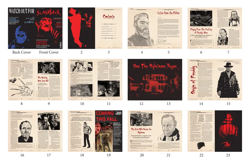
I made a flatplan of all the pages to get a good idea of how many spreads I wanted each article to span and where to place the advertisement. I also changed the colour palette for the back cover promoting the next issue to indicate to the reader that the primary colour used is unique to the presented slasher of each issue.
The Prototype
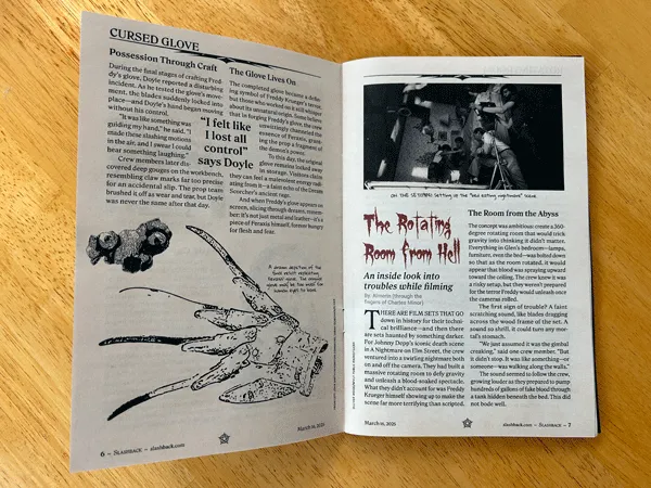
I printed a prototype to ensure all the measurements and document setup were accurate and to see if the font sizes and colour pairings were accessible for readability. I used matte paper to encourage muted, darker tones to fit the dark theme of the magazine. I am very happy with the result and feel I properly captured the spooky vibe I was aiming for.

End Result
I used InDesign to make paragraph and character styles and set the baseline grid. After laying out all my text and imagery, I adjusted the body copy to eliminate widows, orphans, and other spacing issues. I learned a lot of interesting image treatment techniques in Photoshop, particularly with making photographs look like inked drawings. As a designer who typically works more in Illustrator, I found it rewarding to step outside the tools I’m accustomed to and broaden my skills by becoming more confident in other programs.
*Disclaimer: Freddy Krueger was created by Wes Craven and is owned by the Wes Craven Estate. Jason Voorhees was originally created by Victor Miller; adult Jason and franchise elements are owned by Horror Inc. Movie Maniacs is owned by McFarlane Toys. I am not affiliated with any of these entities. This is a concept project.